Logos We Love (with Ana Realmuto)
In the fourth installment of Logos We Love, Athletics Designer Ana Realmuto shares her favorite marks of summer.
In previous segments, Executive Creative Director Malcolm Buick curated an eclectic selection of logos inspired by peace, party, and prestige, Senior Strategist Zander Abranowicz shared his favorite marks from the animal kingdom, and Designer Ellen Voorheis assembled an all-star line-up of brand mascots.
Ana writes:
“With summer in full effect, I thought it would be fun to take a trip down memory lane and remind myself of the classic, absurd, and expressive logos of my childhood. It’s fair to say that many of these are chaotic, though iconic nonetheless. In all their summer glory, here are five logos that look like blue skies and smell like sunscreen.”
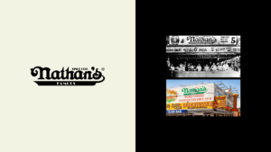
Nathan’s Famous
“We truly cannot talk about summer without talking about Nathan’s Famous. The ornate logo and famous green lettering have been the face of the brand for over 100 years. It was cleverly designed to establish itself as a household name from birth, and has more than proven itself as such by remaining unchanged since its origins in 1916. Similarly, its legendary hot dog-eating contest is equally storied and is rumored to have originated out of an argument over who was most patriotic. What better way to settle that quarrel than competitive feasting?”
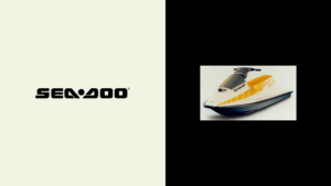
Sea-Doo
“Less of a memory and more of a dream, Sea-Doo’s custom blocky wordmark from the 80s feels more reminiscent of a modern irreverent brand than a dated ‘personal watercraft.’ To be honest, I really just recently stumbled across Sea-Doo, but I’m a sucker for these chunky retro wordmarks, and think they’ve upgraded from this wavy number.”
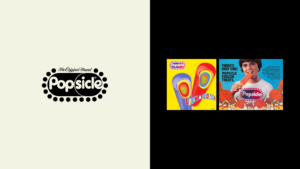
Popsicle
“Sure, this logo breaks every formal rule possible, however, nothing says summer afternoon like those playful round letterforms snug within their big blue and red pill-shaped container. It’s unclear when they started stamping this highly decorated logo on their bright yellow boxes, but the Popsicle brand (and its many iterations) has been around since 1905, when an 11-year-old kid accidentally invented the treat by leaving his drink outside during a cold night. Innovation works in mysterious ways.”

Speedo
“Another classic summer staple, Speedo has only slightly evolved over the past century. While the wordmark has changed, the boomerang emblem has been a persistent symbol for swimmers since the origins of the brand. Summer is nothing without the Speedo. Plus, this Forever21 capsule collection still cracks me up — how could I not include it!?”
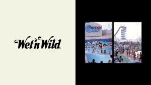
Wet ‘n Wild
“As a kid who grew up in the desert, the water park was essential to summer life, and for me, that waterpark was Wet ‘n Wild. Given that almost all water parks logos are appalling, the original Wet ‘n Wild logo does a lot of things right. Introduced in 1977, the bubbly smooth letters with elongated features are a stark contrast to its overly designed counterparts. The logo has gone through a few iterations, none of which match the original, in my humble opinion.”