Logos We Love (with Malcolm Buick)

There’s a common script to explaining what we do to certain friends and relatives outside the creative field:
KINDLY RELATIVE: So what does Athletics actually do?
GRIZZLED CREATIVE: We offer strategy, design, and technology services for companies and organizations.
KINDLY RELATIVE: Like logos?
GRIZZLED RELATIVE: Sure, like logos.
(GRIZZLED CREATIVE exits, pursued by a bear)
For many, the logomark is king of the brand identity kingdom, happy on its throne beside the queen: the brand name. When we think of McDonald’s, we think of the golden arches. When we think of Nike, we think of the swoosh. It’s a simplistic understanding of brand identity design, one that’s evolved significantly in recent years as iconic brands like IBM Watson and BBC Four have explored kinetic logo systems built to move, and the top-heavy, single-front approach to brand marketing (think television ads) has given way to a bottom-up, guerrilla-tactics approach that requires brands to thrive everywhere at once (think social media).
And yet, the cult of the logo endures. There’s a sinking feeling every designer is familiar with when, in a kick-off meeting for a brand redesign project, it is announced that the logo is “off limits.” Not only is a logo redesign a fun challenge, it also remains a singularly powerful signal of change, creating an easy opportunity to draw interest and attention toward a rebranding effort. And in turn, rebranding efforts are prime opportunities to draw attention to new strategies, offerings, or positions by companies or organizations. Of course, there are countless examples of this logic falling on its face, and publicly critiquing logo designs has become a sort of bloodsport in the creative industry. Any way you cut it, a logo is never just a logo.
Here, Athletics Partner and Executive Creative Director Malcolm Buick reflects on some of his favorite logos, and considers how they’ve influenced his practice.
BBC
Utilitarian and direct, with three simple boxes containing three iconic letters, this iteration of the BBC logo resulted from an effort to modernize the mouthful that was the “British Broadcasting Corporation.” Run and managed by the government, the BBC is more than a cherished television channel. It’s a powerful cultural force around the world, and a signal of quality, honesty, and reliability. On our television sets growing up, the BBC was pretty much all we got, specifically, BBC1 and BBC2. Contrasted against the flood of content we’re presented with every day today, I sometimes wish we could return to the simplicity of two channels. What you see was what you got. Just like this logo.
More information here
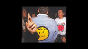
Acid House Smiley Face
The Acid House Smiley Face made its way into my world in the second summer of love in the late 80s UK. I was probably a little late to it even then — to note, I was still on the younger end of high school, I’m not that old! It conjures up memories of a local nightclub that held all-nighters, friends that made their own bootleg shirts, illegal dance parties in fields, and the sonic mash-up of rock, pop, and house pursued by groups like The Happy Mondays and Stone Roses, forming the unique soundtrack of this era. Both of these bands, and many others, borrowed the Smiley Face logo, using it in various forms of communication. When I see it, it recalls positive moments from my early teens. I mean, who doesn’t like a big yellow smile? With 97% recognition around the world as a symbol of positivity, it seems very few.
More information here
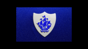
Blue Peter
Blue Peter is the longest-running children’s TV program in the world, shown on BBC1 every day. The show, which has had continuous seasons since it first aired in 1958, is named after the blue and white flag hoisted when a ship is ready to set sail from port. The show is intended to be a voyage of adventure and discovery for young viewers, covering new topics every day. Watching Blue Peter was a shared experience for every young kid growing up in Britain, and to receive the Blue Peter badge, presented to children from all walks of life for good deeds in the community, was of the highest of accolades. For me, no other single logo conjures such a sense of joy, simplicity, adventure, and goodwill.
More information here
Madness
From scrawls on school jotters, to penning your best mate’s arm, and pretty much drawing it on everything you could get your hands on, copying the Madness logo was a rite of passage for young kids like me amidst the turbulence of 1980s Britain. The iconic Madness mark was designed by the ever-brilliant Barney Bubbles in 1979 for the “One Step Beyond” single, a simple capital letter “M” with a jaunty trilby perched on top mimicking the ska style of the time, always, always in black and white. Apparently, during one gig, 75,000 mad Madness fans danced so hard during a performance of “One Step Beyond,” they caused a tremor of 4.5 on the Richter scale.
More information here
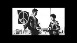
Campaign for Nuclear Disarmament
One of the most widely known symbols in the world, what we commonly call “the peace sign” originated in the Campaign for Nuclear Disarmament (CND), founded in 1957 in the United Kingdom. The mark was designed in 1958 by Gerald Holtom, a professional designer and artist and a graduate of the Royal College of Arts. He showed his preliminary sketches to a small group of activists at the Peace News office in North London, and to the Direct Action Committee Against Nuclear War, just two of several smaller organisations that came together to set up the CND. A conscientious objector who had worked on a farm in Norfolk during the Second World War, Holtom explained that the symbol incorporated the semaphore letters N(uclear) and D(isarmament). It was a simple, elegant, and powerful series of lines that went on to become bigger than the bomb itself: a symbol of freedom, and free for all to use as it was never copyrighted. And used it was by me, as a schoolboy in defiance to teachers, parents, and pretty much anyone else that got in my way 🙂
More information here