Logos We Love (with Zander Abranowicz)
In the second installment of Logos We Love, Senior Strategist Zander Abranowicz shares some of his favorite marks, crests, and colophons, featuring ample cameos from the animal kingdom. In our previous segment, Executive Creative Director Malcolm Buick kicked off the series with an eclectic selection of logos inspired by peace, party, and prestige.
“As I was curating my list of beloved logos, I realized that most of my selects featured animals of some sort. This no doubt speaks to my Durrell-esque interest in all things that slither, swoop, graze, climb, and swim. I decided to dispense with other great marks (goodbye Maersk, Café de Flore, Popeye, Cornell University, and Okeh) and lean into my wild side. So without further ado, here are five logos I love, united only by their claim of fanciful creatures.”

Coat of Arms of the Princely State of Hyderabad
Just before COVID grounded global travel, I found myself visiting Chowmahalla Palace in Hyderabad, India. The palace, now a museum, is the ancestral seat of the Nizams of Hyderabad, a line of Islamic monarchs that ruled this part of India from the decline of the Mughal Empire in 1724, through the British Raj, until Indian independence in 1948. Mir Osman Ali Khan, the seventh and final Nizam, was reportedly the wealthiest man on earth until his death in 1967. Starting around 1900, when cars were extremely rare on the subcontinent, he amassed a fleet of an estimated 400 automobiles. Duesenbergs, Napiers, Bentleys, Packards, Rolls-Royces, White Steams, and Hispano-Suizas all graced his garage, a small sampling of which remains today for public viewing. I was drawn to the more utilitarian olive-green Jeeps and Fords, but couldn’t deny the crown jewel of the collection: an exquisite yellow Rolls-Royce Silver Ghost, made to order for the Nizam’s father, Mir Mahboob Ali Khan, in 1911. He didn’t get to enjoy it very long, dying that same year. Each vehicle features a carefully hand-painted coat of arms, lending a distinctly Tintin touch.
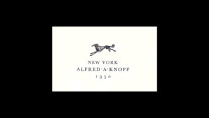
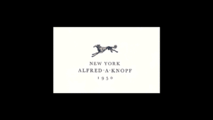
Alfred A. Knopf Books
Scanning my bookshelf, winnowed down to the essentials during a recent move to Virginia, I notice that many of my favorite titles, by authors like Joan Didion, V.S. Naipaul, William Alexander Percy, Toni Morrison, and Robert Caro, all share a common imprint: Knopf Books. The publishing house, founded by Alfred and Blanche Knopf in 1915, is credited with widening the literary horizons of Americans to include European voices like Sigmund Freud and Simone de Beauvoir, as well creating a platform for African American luminaries associated with the Harlem Renaissance, including Langston Hughes. Blanche created the iconic colophon, featuring a regal Russian wolfhound, or borzoi. To me, it is the perfect avatar for this literary institution, symbolizing the grace of a mind in full stride. The logo has been reworked hundreds of times over the past century, including this ornate 1938 interpretation by W.A. Dwiggins, and this 2011 open call for the “Design-a-Borzoi” contest. I’ve even heard whispers of a five-legged borzoi that haunts the spines of certain rare first editions in the fantasy genre.

Lowndes County Freedom Organization
Lowndes County, Alabama, which sits 30 miles east of Selma, was the site of so much racial violence during the voting rights movement that it bore the nickname “Bloody Lowndes.” Though the county was 80 percent Black in 1965, only a single African American citizen was registered to vote. That year, Stokely Carmichael, a young leader with the Student Nonviolent Coordinating Committee (SNCC) and future “honorary prime minister” of the Black Panther Party, arrived in Lowndes to register voters, leading to the formation of the Lowndes County Freedom Organization. The LCFO chose a black panther as its symbol and “Black Power” as its motto. John Hulett, one of the founders of the organization, explained the choice: “The black panther is a vicious animal, as you know. He never bothers anything, but when you start pushing him, he moves backward, backward, and backward, and then he comes out and destroys everything that’s in front of him” (quote sourced from the SCNCC Digital Archive). The organization, and its searing logo, represented a new, uncompromising brand of political self-determination for Black Americans, finding its fullest expression in the 1966 formation of the Black Panther Party in Oakland.
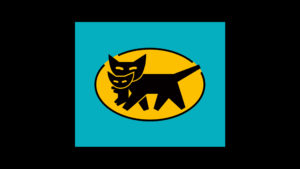
Yamato Transport
As a strategist working closely with designers, I’m often faced with the challenge of helping translate value systems into visual systems. Few logomarks epitomize the seamless union of strategy and symbology like that of Yamato Transport, Japan’s leading logistics company. Framed by safety yellow, a black cat gently carries her kitten, conveying the brand’s promise of unparalleled care for the goods they’re trusted to transport. When I visited Tokyo in 2019, the Yamato mark was a ubiquitous feature of the urban landscape, like the US Postal Service eagle or FedEx wordmark here, only on steroids. Fun fact: If you’re a fan of the 1989 Studio Ghibli film Kiki’s Delivery Service, you may recall Jiji, the chatty black cat. Jiji was directly inspired by the Yamato mascot, as the logistics company was a corporate member of the film’s production committee. (Coincidentally, Kiki’s Delivery Service also had a great logo). If you find a good cap with the Yamato cats on it, let me know, I’ve been searching.
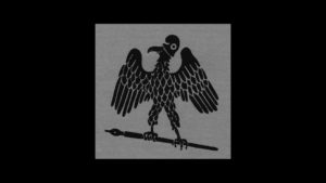
The Paris Review
The Paris Review logomark was designed by William Pène du Bois, the literary journal’s art editor from 1953 to 1960. It features a grinning hadada ibis, gripping a fountain pen, wearing a jaunty phrygian cap. I find the choice of headwear interesting, for a few, centuries-spanning reasons. The soft, conical, and decidedly unflattering headwear has its origins in ancient Rome, where a primitive version of the design, known as a pileus, was worn by emancipated slaves. During the American Revolution, the phrygian cap became associated with the cause of liberty, likely in an attempt to situate our independence movement as the successor to a political tradition originating in Greece and Rome. A century or so later, things really got interesting, when, in 1856, the chief sculptor of the new United States Capitol dome, Thomas Crawford, proposed a phrygian-capped Statue of Freedom to crown the structure. Jefferson Davis, then Secretary of War, and later the first and only President of the Confederate States, furiously resisted the monument. Specifically, he took umbrage with the inclusion of a phrygian cap, which, considering its historical association with emancipation, he perceived as critical to the institution of slavery. In the end, Crawford relented, capping the figure with a Roman helmet, “the crest of which,” according to the sculptor, “is composed of an eagle’s head and a bold arrangement of feathers, suggested by the costume of our Indian tribes.” This is the version that now gazes out from our beautiful and ever-contested temple of democracy. I have no idea what du Bois was thinking when he put pen to paper, but this is what I see when faced with that goofy ibis, inviting me to slow down and get lost in great literature.