Tia
Women’s Health Reimagined
Athletics partnered with Tia to refresh their story, brand voice, and identity system to speak to a much more diverse and age-inclusive audience. Tailored to the whole you, Tia offers virtual and in-person healthcare appointments that are accessible and affordable: holistic healthcare truly designed for women. Building from the new brand system, Athletics collaborated with Big Spaceship, Tia’s video campaign partner, to translate their new message into a complete 360º campaign.
Our Role:
Research and Strategy Art Direction Brand Identity Brand Voice
A mark of casual competence
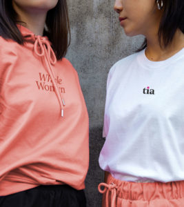
The most obvious change to Tia’s brand may be its updated wordmark. In line with our strategy to elevate perceptions of clinical competence, we’ve evened out kerning and simplified type to draw attention to one idiosyncrasy only: Tia’s signature pink-dotted “i.” Notably, we opted for a lowercase “t.” We did this to balance the mark and preserve some the original’s youthful approachability. The result is a wordmark you can trust to handle your medical needs and be there for you as a friend.


A welcome tone shift
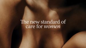
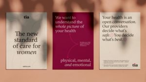
To support Tia’s ongoing expansion of physical, in-person locations, we shifted their palette from a set of brighter, digital-oriented colors to a selection of warmer, earthier tones that will be more welcoming for visiting members. The new palette is anchored by a spectrum of calming neutrals ranging from lighter cream to darker terra cotta and brick. Playing off these neutrals are our most prevalent hues: a bright poppy and rich raspberry. We kept a neon “Tia pink” for accents and UI elements and added a set of tertiary colors (pistachio, gold, white, and black) for supporting details.
Upping sophistication with type
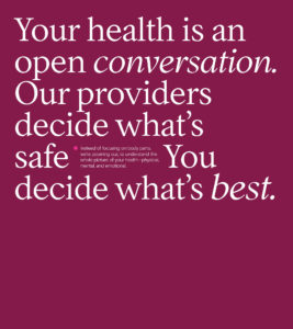
One of our brand objectives, beyond appealing to a more diverse community of women, was to elevate perceptions of clinical sophistication. We selected Tia’s new typefaces with this objective in mind. For headlines and large type moments, we are using a modern take on a literary, 17th-century Garalde typeface called Inferi. For body copy and subheaders, we are using a functional sans-serif called Basis Grotesque. Pairing the two results in a typographic treatment that conveys both editorial gravitas and grad-school competence—repositioning Tia as a voice of clinical excellence.
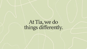
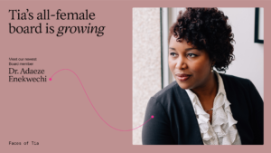
Drawing a non-linear line
Healthcare is personal, and no two journeys are the same. Each has its own unique twists and turns, moments of clarity and moments of frustration. Our line graphic treatment is a subtle way of acknowledging this truth. Paired with copy, it helps Tia tell an open, honest story about the non-linearity of modern medicine—a story many healthcare providers would rather not tell.