The Counter
Fact and Friction in American Food

The Counter is an independent digital newsroom conducting deep investigative journalism to heighten awareness around America’s ever-changing food system. In 2019, the award-winning team aimed to widen its audience beyond industry insiders to include anyone interested in the political, economic, and ethical implications of what we eat. Inviting Athletics to the table, The Counter (then called The New Food Economy) sought a new brand strategy, name, identity, and digital experience. Launched January 2020, The Counter’s new visual and digital presence offers a broadened audience captivating stories that encourage smart choices as consumers and citizens.
Our Role:
Brand Identity
Brand Writing
Digital Publishing
Naming
Research and Strategy
Responsive Web Design and Development
UI / UX Design
Collaborators:
Robbie Sherrard

Food news for a nation with a lot on its plate
Founded by Jeffrey Kittay, the creator and editor of the legendary magazine Lingua Franca, The Counter (previously New Food Economy) had been in digital circulation for four years by the time it approached Athletics. Its journalists had broken stories on issues ranging from CRISPR technology to the rise of young and minority farmers, published pieces in partnership with The Atlantic, The Intercept, and The Guardian, and beaten major publications like The New York Times and NPR to press on critical stories—sometimes by months.
Intersecting ideas and colliding concepts
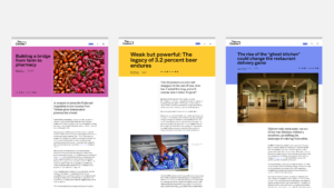
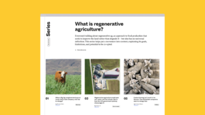
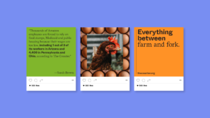
Armed with a new name, we designed a visual identity inspired by the intersection of food and the environment, business, politics, technology, and culture—the Counter’s five core content pillars. Among other tactics, the system employs clever typography, dynamic photography, and striking color to convey this concept. Two distinct typefaces hint at a collision of ideas, while allowing the organization to signal shifts in tone: urgency with a bold san-serif, or editorial seriousness with a sophisticated serif.
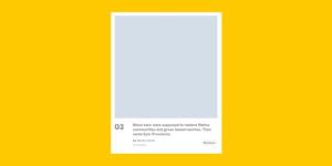
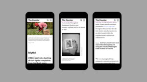
From the frontlines of American food
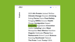
On The Counter’s fresh new digital platform, designed and developed by Athletics, a new homepage and navigation conceit initiate readers into the newsroom’s dynamism at the very first bite. Streamlined around our five content pillars, we made it easy to identify reporting that speaks to the reader, encouraging them to keep exploring with related articles and extended series.


From the ground up
Our teams defined the brand strategy through a series of workshops, determining that the newsroom’s higher purpose is to “help readers understand the changing landscape of food, so we can all make informed choices as consumers and citizens.” Its proposition was distilled to “rigorous reporting on how the environment, business, politics, technology, and culture influence how and what we eat,” which defined our content pillars.