Reaktor
Software in the Spotlight
Reaktor builds custom software of the highest order, digital products powering some of the world’s biggest brands. They even launched Finland’s first commercially built nano-satellite. As a global agency with offices in New York, Tokyo, and Lisbon, Reaktor engaged Athletics to elevate their brand identity and digital experience to reflect their global reach and distinguish them from other technology consultancies. The result is an innovative and holistic identity system the embodies Reaktor’s mission: “creating the future” and “transforming the world.”
Our Role:
Research and Strategy
Art Direction
Brand Identity
Brand Voice
Website Explorations and Prototyping

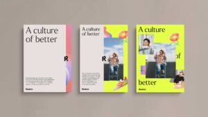
A Culture of Better
We started by defining a brand platform that maintains the tension between Reaktorians’ ambition and their humility. Instead of dreaming into a distant tech future, we root ourselves gamely in the present. Instead of harping on about digital transformation, we commit ourselves to iterative, one-step-at-a-time progress. Instead of claiming to be the best in the business, we champion innovative ways of working that will help Reaktor and their clients improve. This is Reaktor’s “Culture of Better,” a platform for external marketing and internal company practice.


Capturing competitive advantage
Reaktorians are consummate professionals, but their magic is their creativity—the imagination, eccentricity, and ingenuity they bring to every project. We wanted to preserve this personality at all costs, so we explored a visual identity in two layers: one that projects cool-headed formality and another that gives prospective clients and hires a peek behind the consultancy curtains. Our shorthand for these two layers is IQ (more buttoned-up, structured) and EQ (more playful, organic).

Tailoring a new toolkit
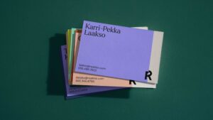
Reaktor’s existing “R” logo signified duality, but it did so by conveying brokenness— symbolizing a particular twenty-tens’ penchant for disruption, making stuff and breaking stuff. (The “R” literally broke apart on hover, as did navigation items.) Not wanting to throw brand equity out with the bathwater, we adapted the mark, ever so subtly, to be less about breaking things and more about the Reaktorian duality of IQ and EQ. The two halves of the mark are more balanced now, and it is incorporated as a dividing element between the formal structure of IQ and the organic playfulness of EQ.


Exploring a new content library
The notion of a signature duality between IQ and EQ became an organizing principle for site explorations as well. One concept was to bring previously siloed Reaktor.com content (blog posts, articles, podcast episodes, announcements) closer together into an expressive, exploratory content library—and to organize it in such a way that it could be made filterable and searchable.
"Athletics partnership and collaboration helped us develop a new brand system that is a true celebration of Reaktor's work and people."
Riikka Friman. Chief Marketing Officer at Reaktor


