Okta
The World’s Identity Company
Founded in 2009, Okta has grown to be a leader in identity authentication and access management. Unlike others in the industry, it doesn’t lock users into a proprietary digital ecosystem. It works with any technology, on any platform.
The Okta rebrand — a deeply collaborative effort between Athletics and Okta’s internal brand team — better positions Okta not only to lead, but to own, the very category they helped create.
Our Role:
Brand Identity
Concept Development
Art Direction
Motion Graphics
Video Direction
Physical Environments and Exhibitions
Brand Writing.
A radiant, human story.
When we’re most ourselves, when we’re in control of our identity, we’re radiant. Energy springs out from our core. We’re free, in the moment, in sync. Our complexity — all of the vibrant layers that make us who we are — come together to form a single, human whole. This is the story we wanted to tell, and that we would breathe life into as a collaborative team.
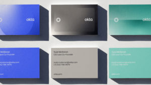
Wordmark
Building on a strong foundation, we streamlined the Okta wordmark with several key refinements. Along with a decrease in weight, the refreshed mark features sharper edges, a firm base for the “t”, updated “k”, and general increase in clarity. An iteration that maintains the charm and personality of the original, while adding poise befitting of a category trailblazer. For further micro-refinements on the wordmark, we partnered with Dalton Maag.
Aura
Building on the language of the wordmark, we refreshed the Okta brand symbol as well — the Aura, a centerpiece, or hinge around which the whole identity system can revolve. It is at once a celebration of the many layers of identity and an illustration of their coherence into a single vibrant point.


People
Warm, casual portraiture and candids — of people at their most inhabited and human —are a key tool for our brand system. This approach sets the tone for representation in the category, and helps the Okta brand stand out in the broader tech space all the more.
Voice
Our refreshed Okta voice channels the visionary, vibrant, clever spirit not only of Okta’s strategic foundation, but of its founding team as well. It’s equal parts prophetic and approachable, like an inventor who sees a possible future and lays a practical plan to get there. In addition to an evolved voice guide, we retouched core elements of brand messaging and provided a suite of headlines to demonstrate the new voice in practice.

Fluid Transitions
The Aura’s fluid, frictionless nature when animated dramatizes the process of seamless verification quite naturally. Its elegance and ease inspire trust whenever applied to a brand experience.
Elements in Motion
Via the Aura and beyond, 3D and motion are an integral part of the new Okta identity. The overall effect is one of kinetic vibrance, of actualized potential, of human dreams made real.


Motion Toolkit
We developed a rich motion toolkit to allow Okta to create a variety of content on a range of platforms. Using the Aura as a vehicle for content and communication.

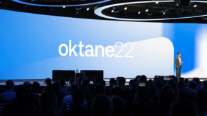
“This week at Oktane22, our annual conference, we announced our brand purpose: to build a world where Identity belongs to you. It’s a bold goal, an expansion of what Okta does and why we do it. And today we’re unveiling a bold evolution of the Okta brand to match.”
John Zissimos, Chief Marketing Officer, Okta


Oktane ‘22
Like the whole of our rebrand process, ideation & iteration for the Oktane creative was a deeply collaborative effort. The heavily-attended event — which featured celebrity guest speakers like Serena Williams and Magic Johnson — became a key milestone in the rebrand rollout.