New York Review of Books
Reader’s Delight
In 2020, coming to us with just over 145,000 subscribers, the New York Review of Books catered to a small but exceedingly loyal audience. The Review invited Athletics to create a new digital platform aimed at attracting the next generation of readers, while not alienating their core reader. We developed a new digital design system to enhance the reader’s experience, giving the publication a more contemporary look and feel while still honoring its print heritage.
Our Role:
Digital Publishing
Digital Collateral
Research and Strategy
Responsive Web Design and Development
UI / UX Design
Turning the page
The publication’s leadership recognized that despite the diversity of its staff and stable of contributors, its readership was skewing older, white, and male. Simultaneously, print subscriptions were declining across the industry. The Review needed to appeal to a new generation of readers, without alienating existing subscribers. Understanding that a modern product platform would be critical for its continued growth, The New York Review of Books brought Athletics on board with the objective of welcoming new readers to a fresh digital experience befitting its well-earned cultural pedigree.

“Our hope is that the freshness, dynamism, and color of the site communicate something about the writers and thinkers we are publishing today, while also honoring not only the founders but the urgency of the first-ever issues.”
Emily Greenhouse, Editor

Reading between the lines
Conducting stakeholder and audience interviews, we learned that the redesign needed to give equal treatment to print and online-only content, the latter having been traditionally deprioritized in design. We also came to understand that the Review’s readers are singularly focused on the writing, to the point of being neutral on the prospect of a platform redesign. This indicated an openness to change that allowed our teams to explore and implement bold ideas. Finally, we established that The New York Review of Books needed to more clearly communicate that it is about so much more than book reviews, with commentary and coverage on a wide range of subjects ranging from art to television to politics.

“Athletics' design makes it easy for us to add new content to existing content from the print issues in a way that seems natural and not intrusive.”
Rea Hederman, Publisher
Hot off the digital presses
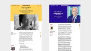
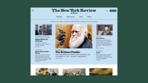
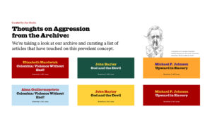
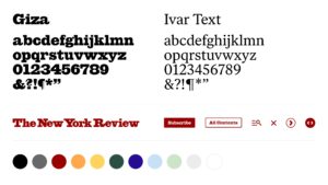
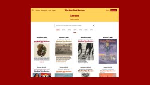
We developed a new digital design system to give the publication a more contemporary look and feel while still honoring its print heritage. Applying this new identity to a re-configured site architecture, we sought to provide existing and prospective readers with a sense of breadth and depth at a glance. Central to this objective was defining a set of content verticals that would not only organize the Review’s vast library of content, but also instantly communicate that the publication covers more than just books. Our intent was to create a digital identity that was fresh and unexpected, but directly inspired by the Review’s print identity.


From scrollers to supporters
Addressing a perennial challenge for digital publishers, the site redesign and relaunch established a new paywall and monetization strategy. The new paywall is built to give the Review team greater control over what content lives behind the paywall, and what readers can access for free. Additionally, the system introduces free accounts, which offer no-cost content and access to the Review’s newsletter. The result is a set of new channels and opportunities to build a devoted readership, and ultimately, promote subscription.

“Three months after launching, registrations to our newsletter list have skyrocketed and paid subscriptions through our paywall have more than doubled. Both continue to hold steady, far exceeding our expectations.”
Mike King, Technical Director


