Nashville Soccer Club
The New Beat
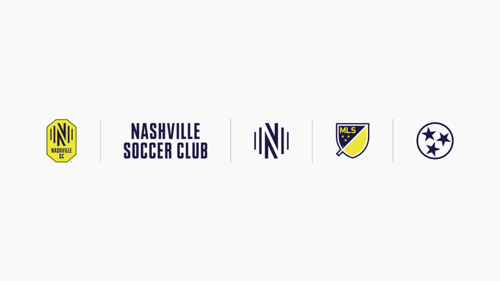
On December 20th, 2017, Nashville was awarded a Major League Soccer expansion franchise. Under team owner John Ingram’s leadership, Nashville SC aimed to create an active soccer community with top athletes and a vibrant fanbase. Athletics crafted the team’s visual identity, covering everything from crest to color to typography, incorporating subtle nods to Nashville’s musical heritage without being cliché or predictable.
Our Role:
Art Direction
Brand Identity
Motion Graphics

The new beat
Nashville holds a distinct place in the American cultural imagination, one occupied by hot chicken joints, jukeboxes, freewheeling country music stars, and legendary venues like the Grand Ole Opry. But Nashville is so much more than that, and we wanted to capture the full spirit of the city without the use of cliché musical iconography, like musical notation or guitar silhouettes. Hence the idea of “the new beat,” which for us evoked an evolution of Nashville heritage while still honoring the city’s honky-tonk roots. In a rousing manifesto, we captured the spirit of…
“A new sound
Not the same old songs on a dusty jukebox
No, this is something different, something bigger
Faint at first, it grows
The new beat
The sound of 2 million Nashvillians on the march.”


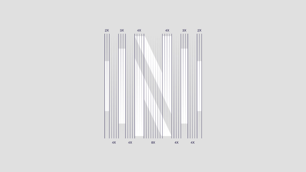
Make some noise
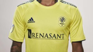
Public input was critical. We learned that fans wanted to keep the name “Nashville SC” and the existing color palette, which left us open to design a new crest based on the idea of “the new beat. We got to work designing a modern crest inspired by sound-waves, to capture the new pulse of a changing city, and the rise of an extraordinary new soccer community. From patterns to fan merchandise, these sound-waves formed the common thread throughout the design system. We’ve been thrilled with the public response to the new brand, which we hope does honor to the great city of Nashville and its new team.