Major League Soccer
Club. Country. Community.
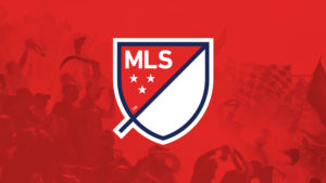
Founded in 1996, MLS is transforming North American soccer, recently securing an historic $700 million renewal with Adidas and a $2 billion media deal with Apple. Embracing “Club, Country, Community,” MLS recognizes fans’ pivotal role. The flexible shield badge symbolizes league and team unity, enabling a joint effort to market and grow the sport. This marks a significant shift in North American soccer, shaping the future with a record breaking partnership and fan-centric approach.
Our Role:
Art Direction
Brand Identity
Brand Writing
Concept Development
Digital Publishing
Motion Graphics
Naming
Packaging
Physical Environments and Exhibitions
Research and Strategy
Video Direction
Sound Design
Collaborators:
Berliner Benson, Paul Owen

Rising star
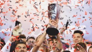
“The beautiful game” is on the rise in North America, and Major League Soccer (MLS), founded in 1996, is to thank for it. Creating a premium soccer experience in the United States and Canada, with homegrown and international talent taking the field, MLS has been responsible for translating the internationally-beloved sport to a North American context, where football, baseball, basketball, and hockey have traditionally dominated athletic fandom. Underlining its continued ascension, MLS recently signed a six-year, $700 million renewal agreement with Adidas—the largest commercial partnership in the league’s history. Today, soccer is the third most-watched sport in America: a metric that would’ve been unthinkable only a few years ago.
“To me this is one of the best American professional league logos that finally dares to do something different, stepping outside of common expectations.”
Under Consideration
Reboot
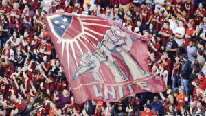
In 2014, MLS was at a crossroads. In the context of rapid growth, an influx of passionate Latin American fans and players, and an enhanced quality of play thanks to homegrown player retention and the drafting of skilled international players, MLS recognized that its existing, highly “literal” identity simply did not capture the spirit and speed the league was becoming known for. Enlisting Athletics to completely reimagine its brand identity from the ground up, the league made it clear that the new brand would have to translate fluidly to the digital realm in order to succeed.


For the fans
“Club, Country, Community” became the strategic anchor defining the league’s new vision. A pure platform for competition, MLS knows that its fans are what makes it special. In turn, the solution was to design a brand for the fans as much as for the teams themselves. Knowing the importance of millennial voices in popularizing the new identity, MLS wanted a system that could be adopted and adapted by digital natives for their own local teams.

Badge of honor
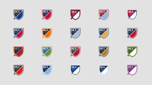
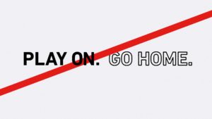
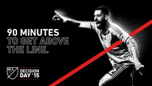
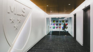
Heraldic symbolism is common in international soccer branding. Badges are useful for inclusion on jerseys and other collateral, and give fans and players alike a common flag to rally around. They also speak to tradition and a shared set of values over generations. MLS wanted its own badge, but we knew we didn’t want to create something overtly “traditional.” Instead, we designed a shield with two halves (in reference to the two halves of a soccer match), with one side reserved for the league, and the other for the teams. Designed to accommodate each team’s specific color palette, it would also accommodate unique sponsorships, partnerships, and events. Every aspect of the badge is symbolic, from the perimeter, which represents the lines of the field of play, to the 45 degree slash, which represents the sport’s upward trajectory in North America. Though an official MLS version in red, white, and blue was the core logo-mark, the badge worked as a flexible template that anyone could take and make their own. As testament to the logo-mark’s flexibility, Reddit users have taken the badge and made it their own—see the results.

