IBM TechXchange
Community & Learning for Technologists
Athletics worked with Blue Studio, IBM’s brand experience and design team, to develop the identity for IBM TechXchange, a client advocacy program for a technical audience addressing two fundamental needs: learning and community. The IBM TechXchange identity centers around a grid of elements: a space where different facets of the IBM Technologist community come together to create and connect.
Our Role:
Art Direction
Brand Identity
Brand Writing
Motion Graphics
Research and Strategy
Collaborators:
Blue Studio, Zander Abranowicz
Meet technical experts where they are and take the next step with them
Athletics worked with Blue Studio, IBM’s brand experience and design team, to develop the identity for IBM TechXchange, a client advocacy program for a technical audience addressing two fundamental needs: learning and community. The IBM TechXchange identity centers around a grid of elements: a space where different facets of the IBM Technologist community come together to create and connect.
IBM’s premier, technical learning event
IBM TechXchange conference is the premier, technical learning event designed with technologists for technologists who use IBM products and solutions. It offers over a thousand technical breakout sessions, hands-on experiences, product demonstrations, instructor-led labs, and certifications tailored to your interests and learning style.
TechXchange attendees participate in deep, guided education through hands-on practical experience with the latest IBM tech, including hybrid cloud and AI, hear best practices from real practitioners, interact with IBM experts around product roadmaps, hang out with their peers in a casual and creative environment, and advance their skills through hands on labs and certifications.
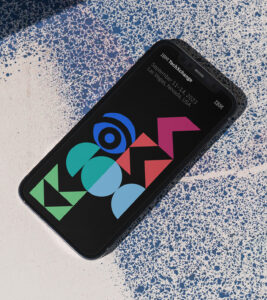
Logo
The logotype for the IBM TechXchange program appears in the context of the IBM master brand and alongside the IBM 8-bar logo.
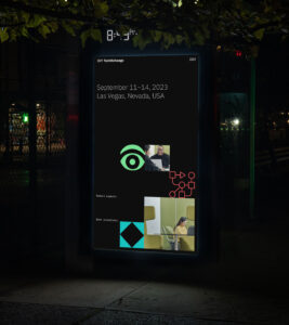
The System
Each element within the IBM TechXchange grid system has its own symbolic meaning, and the grid serves as a framework in which new and evolved elements can be layered in from year to year, and event to event. The system’s design language is purpose built to function in an interactive and programmatic fashion.
Motion
Motion is an integral piece of the IBM TechXchange visual identity; it brings the canvas to life and evokes the ever-changing nature of technology. The identity’s motion design language features a combination of immediate cuts, snapping movements, and continuous linear looping to build a simple and effective motion language that feels technical yet direct.
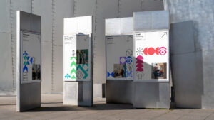
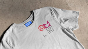
The Grid
The hero grid is composed of four core com-ponents, each of which carries its own symbolic significance and unique visual style:
Shapes
One is a series of reductive yet illustrative shapes, each of which represents connection.
Rebus
Next, individual elements from Paul Rand’s iconic rebus, each of which represents IBM.
Pictograms
Relevant pictograms from IBM’s existing library represent technology, both generally or specific technologist to a particular technical track being discussed.
Photography
A library of photography represents the attendee. Photography features technologists interacting with each-other or with relevant software or hardware and serves to celebrate human interaction, collaboration and learning.
“IBM TechXchange brings together technologists from around the world and provide education through hands-on experience with the latest IBM technology”
IBM Communications
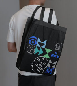
Color
The IBM TechXchange color palette is derived from IBM’s master brand. The wide spectrum of hues have been chosen to represent the diversity of thought and representation that will be present at the event.
Typography
IBM Plex™ is the approved typeface for all of IBM; as such, it is the brand typeface for IBM TechXchange. All text within the hero is set in IBM Plex Mono, while all text outside of the hero grid is set in IBM Plex Sans.