Brooklyn Steel
Steeling the Show
Our Role:
Brand Identity
Brand Writing
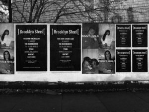
Physical Environments and Exhibitions
The Sound of Steel
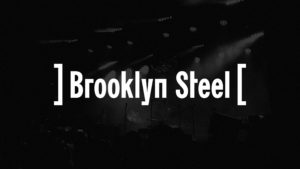
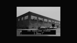
Brooklyn Steel’s new identity compliments its industrial space and surrounding neighborhood, providing concert-goers with the feeling of attending an underground music experience with 1,800 friends. The identity is built upon a backwards bracket that surrounds the Brooklyn Steel title, the significance of which is two-fold. When activated, the bracket reflects a stage curtain opening and closing to reveal musicians on stage. When joined, the brackets form a steelmade I-beam, a reference to the history of the space.

See the coverage of Brooklyn Steel’s launch in The New York Times.
Read More
Industrial Chic
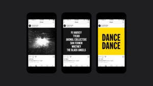
The Brooklyn Steel brand aesthetic takes cues from the venue’s architecture with an industrial, high contrast color palette — black, white and yellow — and a blocky custom typeface created in-house by Athletics. Wayfinding signage evokes the safety graphics which often appear in factory settings, while simple verbal messaging creates hidden moments of discovery throughout the visitor experience.

Rock Onward
Brooklyn Steel has quickly become one of Brooklyn’s most beloved venues. The space boasts incredible acoustics, while its subtly-sloped general admission area maximizes visibility for all attendees. Since launch, bands ranging from LCD Soundsystem to Pixies to Christine and the Queens have graced the stage.


“Athletics brought a high level of quality and thoughtfulness to the branding conversation for Brooklyn Steel, presenting interesting and inspiring new takes and opinions for consideration, leaving us with a final product that feels organic to the venue and fan experience.”
Charley Magrew, VP of Marketing, The Bowery Presents