Record Time with Malcolm Buick

Predictions are like opinions: everybody has one. So please do not take this as a prediction. Think of this instead as a subjective aspiration for the field of design, informed by my meager 25 year tenure as a designer, creative director, and creative business owner.
In the hyper-connected digital mainframe of design, the past decade has delivered both delight and decay, progress and decline. All creatively curious people now enjoy instant access to global design currents, bearing unforetold riches and an endless scroll of visual pleasure. With this glut of knowledge and a dizzying array of tools at our disposal, creation oozes from our field at a staggering rate. If this were the oil industry, it’s as if we went from operating scattered wildcat mines to industrial rigs overnight. Unfortunately, it often feels like our capacity to produce at volume has outpaced our tendency to think with depth. This is, needless to say, a concern as old as time.
Any veteran of the creative industry has had this conversation with fellow creatives over cocktails at events or after lectures. We bemoan the way in which the acceleration and democratization of design has set an unrealistic standard for quality at quantity among clients. But at the same time, this demand has built our industry into a behemoth. 7.5% of New York’s Gross State Product (GSP) derives from Arts and Culture, a category that includes Design Services and Advertising.
The homogenized nature of design — in which good ideas are quickly snapped up, repackaged, and bled of meaning or originality in the time it takes to post an Instagram — has left us adrift in a sea of sameness. Hence the expression “blanding,” a common industry pejorative for the type of indistinguishable DTC-style identity system that plasters our subways and sidewalks, promising life without friction. Somewhere along the line, it feels like we lost our way, sacrificing daring for data, and idea for influence. Not all of this class of design is bad, of course. But after a while, it all begins to blend, blurring the edges we work so hard to define between one offering and another.
While undifferentiated design does a disservice to brands and consumers alike, a more urgent concern should take precedence: the creative industry’s undeniable role in the environmental crisis. Thoughtless, impulsive consumption may elevate ROI, but at what expense? Waste is our industry’s dirty secret. Packaging systems may be beautiful when freshly printed, but they look less attractive when shredded and scattered across a landfill, or worse, floating in the ocean. We like to pride ourselves on our industry’s ability to shape human behavior. This is the unspoken power of design. Instead of using that power to facilitate an endless cycle of purchase and disposal, what if we used design to cultivate a new generation of citizen-consumers, one united by common stewardship of the one planet where human life thrives?
That said, please allow me to reminisce. I started out designing record sleeves in London in the mid 1990s, an age of political freedom and a time of national fortune and optimism coinciding (not coincidentally, I think) with a second British Invasion. Pardon me as I show my age, but this was the P.C. age of design (pre computers), and the Internet was simply a twinkle in Silicon Valley’s eye. I had no idea what the designer next door was doing, never mind what a designer in Seoul or Capetown or Mexico City was doing. Searching for the next great photographer, illustrator, or typographer would yield incredible moments of discovery. Design still felt like an instinctual, even primal process.
No aspect of design epitomized this journey more than record sleeve design. The record sleeve was (and remains) a beautiful format, housing some of the most potent moments in graphic design history. 12 inches of card, vinyl, ink, and more often than not, a controversial message. This is what drew me into the world of branding, and here I am. In thinking about the impact record design has had on my career, I decided to reach out to a few friends about the record sleeves that left a mark on their lives.
Paul West
Partner, Form
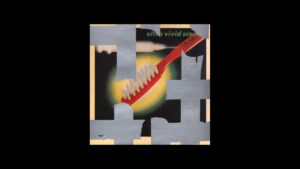
Album Title — Ultra Vivid Scene
Artist — Ultra Vivid Scene
Year — 1988
Designer — Vaughan Oliver
I love this sleeve as it reminds me of the time I spent at the record label 4AD with designers Vaughan Oliver and Chris Bigg. I had worked my thesis on 23e and Peter Saville Associates — both pioneering designers and their respective agencies. In doing so I became good friends with Vaughan and Chris as a student and in my first few years of cutting my teeth as a designer. I freelanced on Vaughan’s extra curricular projects and spent hours in the Alma Road office soaking up the atmosphere of the place. At that stage Vaughan’s work was prolific; he was experimenting with all manner of graphic styles and typographic experiments and this wonderful cover continued his experiments with Japanese offset printers proof sheets that he started so famously with Colourbox in 1985 (which could easily have been another choice). What sets this release apart is his inspired use of wrapping the album in silver gaffer tape, which is of course ‘just’ an emboss but a four-colour, plus silver, plus emboss. This for me sums up the spirit of the era: a groundbreaking label allowing an inspirational designer the opportunity to create some magic for a breathtakingly brilliant album. It’s a punk sleeve, no doubt infused with coded sexual messages which is how Vaughan worked many a time. Why is the hypodermic injecting into an erect “brush?” You can be sure the angle of this toothbrush refers to something. Ultra Vivid Scene was a soundtrack album for me and my friends for years. It’s a shimmering body of work, and the whole package is gorgeous.
Charlotte Strick
Graphic Designer, Artist, Curator, Writer, Art Editor of The Paris Review magazine, Principal at Strick&Williams / @strickandwilliams / charlottestrick.com
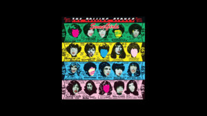
Album Title — Some Girls
Artist — Rolling Stones
Year — 1978
Designer — Peter Corriston
Sometime around the age of twelve, while furtively sifting through bins of vintage records, my fingers struck graphic design gold: a copy of The Rolling Stones’ Some Girls. I had no idea what I held in my hands. The elaborate dye cuts, high contrast wigs, and riotous color and typography all dazzled me. I barely understood the visual wit woven into the sleeve and liner notes, but it reeked of “cool.” I knew it was brave and I sensed it was smart. I plunked down some hard-earned babysitting cash, and headed home with my prize.
It being the mid-1980s, my towering HiFi — a triple-layer cake of sound — awaited our return. AM/FM radio at its base, dual cassette recorders (essential for curating mix tapes) at its center, and a phonograph topped it all off. I set the needle down on the thumping baseline of “Miss You” and listened right the way through to Jagger’s spoken verse on “Shattered.” It became clear that the visual mash-ups of the album artwork mirrored the musical mash-ups (disco! country! the blues!) of the tracks themselves; here was an early lesson in the power of design to communicate ideas!
But it turns out that the history behind all of this visual layering is even more complex. Half a century earlier, before Some Girls topped the music charts, Valmor Products Co., a popular line of beauty products targeted at Black and Brown women and men, was established in Chicago. Valmor’s owners wisely hired the tremendously gifted but still little known African-American illustrators Charles C. Dawson and Jay Jackson. These artists were responsible for the brand’s bold, sexy, and now highly collectable packaging. Today the idea of hawking hair straighteners and skin lighteners seems shockingly racist and opportunistic. In the 20s and 30s, Dawson and Jackson illustrated their ideal buyers as sophisticated and fashionable; their portraits presented people of color in elevated ways never before seen on American beauty packaging. The contradictions are ripe for unpacking.
In 1978, British album designer Peter Corriston recycled the Valmor advertisements, in the mode of the Pop Artists who came before him. The design for Some Girls doesn’t take itself too seriously; it pokes fun at the notion of celebrity by collaging alternative “hairdos” on the heads of vetted mid-century starlets — all of whom, incidentally, threatened to sue The Stones for using their likenesses without permission. (Rumor has it that they were particularly put off by The Stones’ well-branded, luscious red lips that Corriston painted on each of them. They feared it “made them look like drag queens.”) And Valmor, who also didn’t appreciate the appropriation either, was awarded a cash settlement for the unauthorized use. The legal pushback forced a quick reissue of the album artwork and various inventive versions of it remain on the market for future flea market pickers. It’s worth noting that Mick Jagger didn’t hold any of this controversy against Corriston, who went on to design three more albums for the band.
Hector Pottie
Creative Director, Method
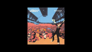
Album Title — Surrender
Artist — Chemical Brothers
Year — 1999
Designer — Mark Tappin
Illustrator — Kate Gibb
For me, the best album cover of the 90s has got to be Surrender by The Chemical Brothers. Designed by Mark Tappin at Blue Source it features the beautiful psychedelic screenprint illustrations of Kate Gibb. It’s such a seminal cover and both the album itself and the extended single releases of Out of Control, Music Response, Let Forever Be, and Hey Boy Hey Girl, are by far the stand out sleeve artworks of the time. A perfect visual encapsulation of a sound and moment in musical history.
Blue Source was a formative place for me. I was lucky enough to work there in the late 90’s. As a wee boy from the Highlands, it was incredible to be part of it. All of the work was deeply knowing and considered, weaving in references of art, photography, fashion, and of course music together in an exquisite output and portfolio. At its heart was the idea of designers working as visual curators collaborating with and directing a diverse collection of image-makers from around the globe. Always seeking out new and exciting creatives to work with. So much talent in one studio tucked away at the top of Ladbroke Grove in West London. And man, those Blue Source parties, totally off the scale.
The cover artwork of Surrender is rich and layered very much like the music represents. It has so many subtle references, feeling ultra contemporary yet nostalgic at the same time. You can feel the process of Kate making it. The ink being pulled across a mesh screen by a squeaky printing squeegee, building up colour on colour. The illustration has soul. There is nothing sleek or manufactured about it. It’s true craft, illustration becoming art. It’s not a design that is shackled or contrived by a marketing message or usability testing, this is a work of pure visual expression and 20 years later it still feels fresh today.
Malcolm Buick — that’s me
Creative Director, Athletics
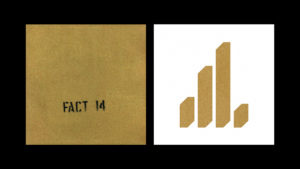
Album Title — FACT 14 The Return Of The Durutti Column (V1 & V2)
Artist — The Durutti Column
Year — 1980 & 2013 versions
Designers — Jamie Reid, Tony Wilson (V1) Peter Saville (V2)
Designed in 1980, this sleeve concept started as an idea from Tony Wilson and Ian Reid, inspired by a 1959 situationist publication by Guy Debord and Asger Jorn. Ever the relentless iconoclast of Factory Records, Tony Wilson hoped that the abrasive packaging would destroy existing record collections in the now long gone records bins one would peruse on a Sunday afternoon. To note, Peter Saville updated the design in 2013, taking on a more reductive, controlled version of the original. Both are beautiful in their own right.
Conclusion
I started this piece promising an aspiration. So here it is. It may be a time for all of us to unlearn some, take a plunge, and draw inspiration from designs of times past to rekindle the spirit in our execution. It’s in our hands as creators to challenge the tried and tested business norms of apathetic clients, and challenge ourselves as creators to forge powerful alternatives. As arbiters of design, and as partners to our clients, we need to empower them with bigger, bolder ideas. Ideas that actually make change, and don’t simply provide a thin veneer of “design.”
I write this not for others (though perhaps others may derive something from it). I write this for myself. It’s a reminder, a charge, a manifesto for myself for 2020 and beyond. Perhaps 2020 is the year that the creative industry — and all of Design with a big D (advertising, fashion, technology, etc.) — tackles climate change. If we don’t, our predictions are as empty as life without music.