Logos We Love (Aussie Edition)

As our “Logos We Love” series continues, Designer Rob Farmer brings along a few of his favorite logos from his home country.
As an Australian you might say I’m biased to think that some of the coolest graphic design has, and still does, come from the land down under. Australian design puts a fun and unique twist on the many different schools of thought and influence from home and abroad. In this list I’ve tried to avoid the more obvious Australian brands like Qantas or Vegemite, and instead recall some of my personal favorites.
It is important to note that this is a very small slice of “Australian” Design, much from a colonial gaze, and to recognize the Traditional Peoples of the continent whose land was stolen nearly 250 years ago. Australia is nothing without the rich history of art, culture, and storytelling of the World’s oldest living culture, and I pay respect to all Aboriginal and Torre Strait Islander peoples.
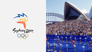
2000 Olympics - Sydney
Reflecting on this logo 23 years later gives me nostalgia for what was such a cool time in my childhood when Australia was home to the World’s games. Designed by Michael Bryce and FHA Image Design, the boomerangs that make up the running character give it a distinctly Aussie flavor and its gestural illustrative style is a time capsule of turn of the millennium design.

Arts Victoria
Designed in 1975, Ken Cato created the stylised letters of A and V that suggested the traditional festive imagery of waving banners. I like to think that they also look like a nice pair of high heels you’d wear to the theater. I love how this logo tessellates into a pattern, developing a clever graphic system.
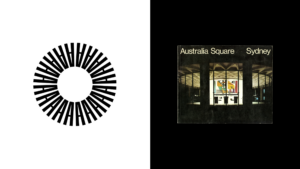
Australia Square
Harry Williamson Designed this logo of radial A’s to reflect the structure’s distinctive cylindrical form (seen pictured). Designed in 1967, I’d be fooled if you told me it were designed yesterday. Timeless stuff.

Angus & Robertson
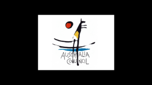
Australia Council for the Arts
The brief was simple, no corporate imagery and unmistakably Australian. Lyndon’s Whaites 1983 response hit the nail on the head; an illustrative kangaroo under the beating sun. Ironically, the sick hand written type was later (and unfortunately) replaced by a more corporate friendly sans serif – such are the times.
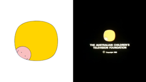
Australian Children's Television Foundation
I could’ve easily filled out this entire thing with the work of legendary Australian illustrator and designer Alex Stitt. Growing up in the 90’s in Australia, it was hard to miss his work. So much so that he feels like a truly integral part of my childhood. I love his illustrative approach to his logo work, seen tenfold in this logo for Australian Children’s Television. Other faves of his are the Alvin Purple and the Theatre Australia logos.

AFL Teams
How cool are these team logos from the early 1990’s? So much personality. These burly representations of Australian Rules Football (AFL, or just footy) team mascots accurately represent the rough and tumble sport that is Australia’s national sport.
For a further look at Australia’s history of graphic design check out the wonderful site Re:collection.