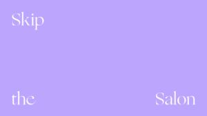
Nimble
Beautiful Technologies
Our Role
Art Direction, Brand Identity, Brand Writing, Motion Graphics, Naming, Packaging, Research and Strategy
Technology for the home age
In an era when staying in is the new going out, Nimble helps people maintain a sense of polish, literally and figuratively. As the Nimble team said throughout our collaboration: It sounds small, but it feels big. Inspired by this tech-powered optimism, we provided guidance on naming, resulting in the light, airy, and essential “Nimble.” In parallel, we developed a brand strategy around the premise of “putting delight at your fingertips,” bringing this idea to life in a short and sweet brand story, inviting brand voice, and lighthearted messaging system. Read more about our perspective on the power of technology in the home here.
20 patents and patent applications protect Nimble’s innovations around the world
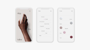


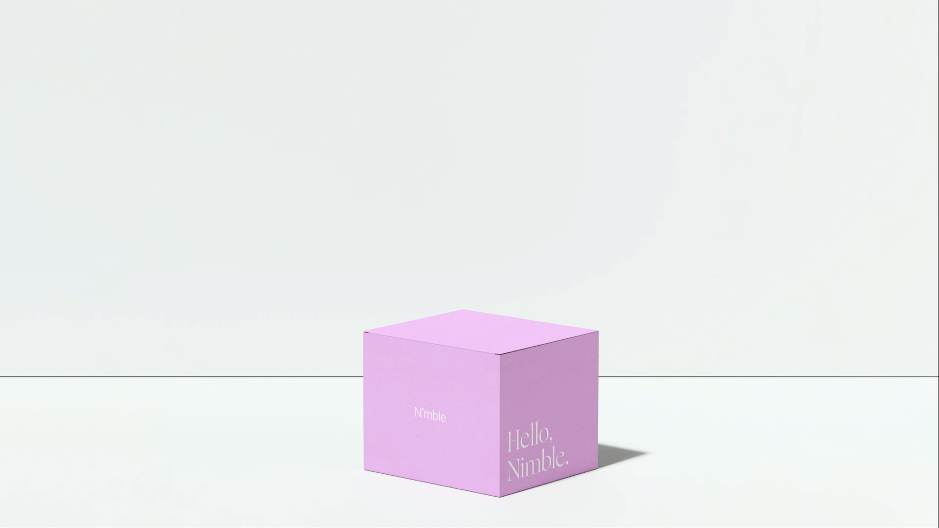
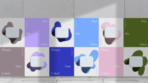
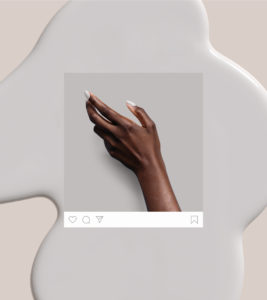
Convenience is beautiful
The visual identity celebrates technology and emotion. Mirroring these dual forces at the heart of the Nimble experience, we selected Neue Haas Grotesk as the precise primary typeface, and Ogg as the calligraphic display font. Focusing our lens on natural faces, graceful gestures, and pared-back products, we developed a photographic style that feels both decisive and fun. Compositionally, we structured a system of floating elements, reflecting the ease and clarity inherent in the Nimble name. Our work ultimately helped inform the iconic industrial design of the device itself. From the site experience to app UX to industrial design, the Nimble brand always feels seamless, and most importantly, delightful.
5,877 backers pledged $1,803,758 on Kickstarter to help bring Nimble to life