Terminal 5
It Might Get Loud
There’s nothing quite like the energy of live music, and
when it comes to New York, The Bowery Presents is the
go-to for unforgettable experiences. With iconic venues like Rough Trade NYC and Webster Hall under their belt, they
set their sights on reimagining Terminal 5, or T5.
Before its renovation and grand reopening, Athletics was entrusted with the task of crafting T5’s fresh brand identity and wayfinding system. The challenge was clear: enhance the venue’s visual appeal while preserving its raw, electrifying essence that fans have come to adore.
Our Role:
Art Direction
Brand Identity
Physical Environments and Exhibitions
Tall, dark, and handsome
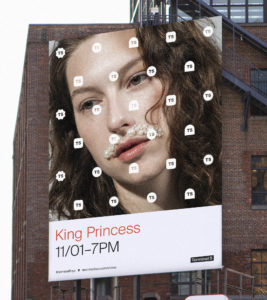
Terminal 5, founded in 2003, is located in the heart of Hell’s Kitchen. One of our city’s premier venues for music, events, and performance, in 2019 alone artists ranging from Dwight Yoakam to Bikini Kill, Big Boi, James Blake, Ice Cube, and King Princess graced its stage. Loud, dark, and cavernous, T5 offers a perfect atmosphere to see high-energy shows by some of the most progressive touring artists of our time. To coincide with the renovation of its three floors and rooftop bar, The Bowery Presents invited Athletics to create a brand identity that would help Terminal 5 break through in a noisy live music category, while helping attendees navigate the notoriously-complicated space.

Crowd control
Attending concerts and events at Terminal 5 to identify pain points in wayfinding and missed opportunities for in-venue brand moments, we also researched systems at other comparable venues to assess what works, and what doesn’t. This included revisiting our branding and navigational work for Brooklyn Steel, another Bowery Presents location with a large, echoing performance space. Finally, we considered other popular attractions known for their navigability, like The Whitney and the newly-reopened MoMA, which, not unlike music venues, maintain consistent branding that flexes to showcase rotating artists and attractions.
Taking flight
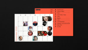
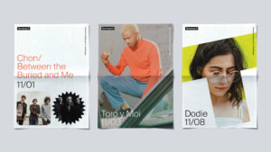
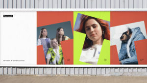
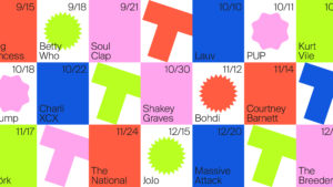
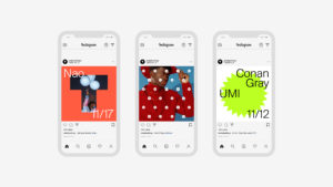
Informed by our research, we built Terminal 5 a distinct visual system that is both bold and flexible, accommodating the need to incorporate rotating artists’ respective promotional assets. Inspired by the venue’s name, we looked to airport signage to inform the clean and direct aesthetic. The “T” letterform (or Super T, as we called it) is drawn from the layout of the venue itself, and forms the root of the entire system. This shape is used to house imagery, video, color, light, and texture in three-dimensional, two-dimensional, and digital formats.