Spring
A Brand for All Seasons
Our Role
Art Direction, Brand Identity, Motion Graphics
Collaborators
West SF, Spring in-house design team
Substance without style
Spring’s existing systems lacked visual finesse to complement the products featured on their site. In response, Athletics knew the new brand identity had to be playful, vivid, recognizable, and flexible enough to populate social, events, digital, environmental, and beyond. Ultimately, Spring’s brand identity needed to make its presence known without overshadowing the brands on their platform.
“Spring offers an aesthetically pleasing way to keep up with the latest products your favorite labels have to offer in one portable and pretty place.”
Refinery 29

Split personality in a single brand
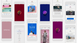
The entire visual vernacular of Spring’s brand identity stems from diagrams of the biannual equinox. The seasonal reference, by extension a reference to the fashion calendar, evokes a sense of freshness and renewal. This notion is most clearly embodied by the logomark, a circle bisected by a line dividing the two color fields. It is a reflection of Spring’s dual nature; Spring is a brand with a perspective and voice, as well as a collection of partner brands. This motif was extended to product photography, digital content, and animations, while the logomark itself appears as the app icon, throughout digital and print communications, and alongside other brands’ logos to announce partnerships.


“It’s all about uniqueness. It’s a crowded marketplace, but the way you win is being unique.”
Alan Tisch, CEO, Spring
Bringing high fashion down to earth
Injecting bursts of color through all interactions, Athletics curated four color pairings, one for each season. Athletics also defined the style of photography, including minimal use of props, colored seamless backdrops derived from our color groupings, a mix of wide range and close up imagery, and suspended motion. In addition, we created a timeless but firmly contemporary wordmark derived from the high-contrast serif typefaces associated with luxury fashion houses. Spring’s in-house copywriter extended the playful, cheeky spirit of our designs to the brand’s textual tone, which was conveyed with a clean, refined set of typefaces.

Spring into action
The renewed Spring app and desktop site were met with positive critical and consumer regard. Vogue, Fashionista, Mashable, Real Simple, The Huffington Post, and Refinery29, and others all covered the brand after the re-launch, and Alan Tisch, Founder of Spring, called Athletics’ work for the company “incredible.” Mashable wrote of the relaunch: “[Tisch] says the experience and aesthetic will make it seem premium with its ‘pops of color’ throughout. He’s most excited, he says, about how the colors will change from season to season. ‘It will feel like a refresh and every couple of months with its seasonal designs…’” We anticipate a bright future for Spring as it continues to attract new, cutting-edge brands and investors to bolster its platform, redefining how Americans shop for fashions online.