KieranTimberlake
Reimagining an Architectural Leader
KieranTimberlake, an architecture firm renowned for its work at the intersection of sustainability, prefabrication, and groundbreaking research, was approaching an exciting milestone. To mark its 40th anniversary and celebrate its transition to employee-ownership, it wanted to reimagine its brand and site experience for a new era. Its refreshed identity reflects its lineage as a leader of architectural research while spotlighting not just the beauty of its environments, but the elegance of design that addresses multiple challenges with one gesture.
Our task, across the entirety of the experience, was to convey a wealth of insight and experience in a nimble, engaging way. Beginning with conceptual exploration across voice and visual identity, we moved quickly into design sprints that integrated digital experience early. In all this work, we show KieranTimberlake to be a generous partner that believes in the transformative power of rigorous design.
Our Role:
Brand Strategy
Brand Identity
Information Architecture
Site Development
Web Design & Development
UI / UX Design
Messaging
Our Approach
KieranTimberlake needed an identity that could compete on a more contemporary footing, one that signaled its enduring rigor while making space for the people and thought that animate the practice. The goal was to hold warmth and rigor in the same frame, as it’s the tension at the heart of KieranTimberlake’s identity: research-backed and exacting in the work, generous and human in the telling.
We worked closely with principals and architects to map evolving needs in a rich, diverse, client ecosystem. The insight that emerged became the foundation for a parallel creative output: visual identity and site expression on the one hand, verbal identity and messaging strategy on the other.
Technical and Narrative
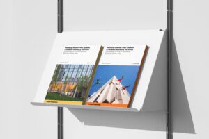
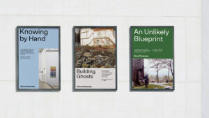
The visual system needed to move fluidly between the technical and the narrative, the documentary and the human. A sans and serif pairing, joined by a semi-mono typeface, gives the firm typographic range from spec-sheet precision to broader storytelling. A bold but nuanced color palette nods to classic modernist hues while drawing on the materials of KieranTimberlake’s own buildings. The worksmark itself is solid and timeless, and an icon suite picks up its geometry to extend the system into a working visual language.
Telling a Story of Practice
Design and research are inseparable at KieranTimberlake, and the site is built to reflect that. A sidebar runs alongside the main content, opening a dedicated channel for the firm’s research practice, a place to dive deeper into the inquiry that shapes the work.
Case studies themselves are designed for multiple modes of absorption: click to engage a slideshow of imagery for the visual reader, narrative for the deep-diver, and longer-form exploration for those who want the full story. Schematic drawings sit beside finished photography throughout, so the work is shown both as it was thought and as it was built.
Showcase, Archive, and a Studio with Character
KieranTimberlake needed to showcase both their work and who they are as a studio.
The work lander carries forty years of practice in a single view, functioning as both showcase and archive. Every project can surfaces, whether it has a full case study behind it or not. A scaling interface lets visitors zoom in and out across the breadth of the firm, and filtering accommodates both modes of visit: the researcher hunting a specific topic and the browser following curiosity.
Where work and research pages let content lead, the studio pages turn up the color, bringing the firm’s identity, voice, and people more clearly into view.