Google Beam
Where Distance Disappears
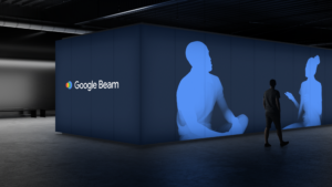
Athletics partnered with Google to help launch Google Beam — a new immersive communication technology that brings people closer together, no matter the distance. Unlike a traditional videoconferencing call, conversations are life-sized and 3D, tapping into all non-verbal details that make you feel like you’re right across the table from someone – eye contact, body language, and the shared energy of human connection.
Our Role:
Research
Creative Strategy
Brand Identity
Art Direction
Brand Voice
Product Renders
Motion Graphics
Collaborators:
Google Brand Team, Google PMM, CATK
Right there with you
Google Beam rethinks what remote connection feels like. It creates space — physical and emotional — for more natural, meaningful conversations. Where typical calls flatten everything, Google Beam adds depth, softness, and warmth. It brings back the human cues that make us feel seen.
And that’s the magic: it feels like you’re right there in the same room. Distance dissolves. Distractions fall away. What’s left is something simple and real — two people, fully present with each other.
The Shape of Connection
At the center of Google Beam’s identity is a symbol — a colorful, layered mark inspired by light and connection. Made of overlapping circles, it represents a kind of portal, a tunnel between two people, two places, two moments in time. It’s a visual metaphor for the technology itself — a bridge that brings you closer.
Used alongside a simple white or black wordmark, the symbol is designed to stand out and stay with you. It’s a reminder of how connection can feel when the tech fades away.


Come as You Are
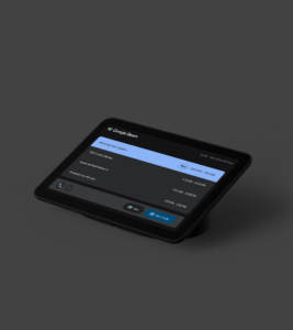
The Google Beam experience is simple, intuitive. For the user, that means no headsets, no tech barriers, no anti-social extra gear. It’s brought to life through a purpose-built device, created in collaboration with HP. A light field display and six high-performance cameras work together to capture people in 3D. It’s a beautifully engineered piece of hardware, designed to quietly do something extraordinary: enhance true human connection.
The result: users come as they are. The technology brings natural focus to eye contact, gestures, and body language that makes it feel like you’re sharing the same space.


A Window to the Other Side
Google Beam’s graphic system builds on the idea of a portal — a way to step into another space. Circles, gradients, and glowing bands of light echo the feeling of being drawn into a moment. These elements flex across formats, sometimes quiet and subtle, other times bold and expressive, depending on the story being told.
It’s a system designed to feel alive — dimensional, fluid, and full of motion.


Familiar, Yet More Human
The color palette takes what’s iconic about Google and expands it to feel warmer and more human. Google core colors anchor the brand in something instantly recognizable, while soft neutrals and lighter tones create breathing room for emotion to come through.
It’s a palette that balances the technical with the personal — confident but not cold. Recognizable, but reimagined for connection.
A Voice You Can Feel
Typography in the Google Beam system is calm, clear, and approachable. Set in Google Sans, the rounded letterforms echo the softness and shape of the logo — open, easy, human.
Whether it’s a bold headline or a quiet message, the type never gets in the way. It speaks the way Google Beam works: directly, and with a sense of care.
Emotion, In Focus
Google Beam is about people — and our portrait photography reflects that. These images zoom in on the little details that make connection feel real: eye contact, a half-smile, a shift in posture, a shared moment of understanding.
The focus is close, the lighting is warm, and the expressions are unfiltered. No overly posed setups — just real people, fully present with one another. It’s about showing what connection feels like, not just what it looks like.
Motion That Draws You In
Motion plays a quiet but powerful role in how Google Beam communicates. Subtle animations echo the experience of being drawn into a moment — a shift in perspective, a sense of depth, a pull toward the person on the other side.
These movements aren’t just decorative. They reflect the product’s purpose: to guide you into presence, into clarity, into real conversation.
What’s Next
The identity for Google Beam is built to grow — flexible, dimensional, and full of light. It captures not just how the product works, but how it feels to use: close, human, and a little bit magical.
Learn more about Google Beam on the Google blog.