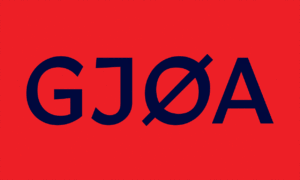
GJØA
New York's Oldest Youth Soccer Club
For GJØA, one of the oldest community soccer clubs in the United States, the game has always been more than sport — it’s an inheritance of culture, camaraderie, and Brooklyn identity. Founded by Norwegian immigrants in 1911, the club continues its legacy for a new generation of players learning to move as a unit, support one another, and play with intention. The refreshed identity honors the club’s maritime roots while expressing the confidence and clarity of modern youth development, creating a shared language across teams, fields, and families. It is a symbol young athletes can take pride in and a foundation for strengthening the community around the game.
Our Role:
Art Direction
Design System
Collaborators:
North Sea Air
A legacy of New York soccer, renewed
For all the soccer culture thriving across New York, few clubs carry the history and community presence of S.C. GJØA. Established in 1911 by Norwegian immigrants, the club has shaped generations of Brooklyn players from grassroots beginners to elite youth competitors, with a focus on teamwork, discipline, and a love of the game. Today, GJØA continues that tradition with a modern approach to youth development, bringing families, coaches, and players together across age groups and neighborhoods. The refreshed identity honors the club’s storied past while creating a bold, unified expression for its future on and off the pitch.


The Spirit of Collective Play
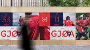
GJØA’s unifying concept is one of togetherness. The identity reflects the club’s role as both a home for player development and a connector across Brooklyn’s diverse neighborhoods. It balances heritage with the clarity and confidence of modern youth sport. At its center is the ship: a symbol of forward movement, shared direction, and collective pride. The wordmark and visual system are built to feel strong, approachable, and distinctly local, a voice that carries from the training ground to match day.


Soccer Rooted in Community
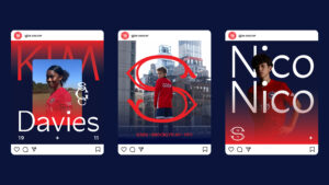
Based in Brooklyn, S.C. GJØA is more than a club. It’s a gathering place for players, families, and coaches who share a love of the game. Training fields across the borough become shared spaces where support, discipline, and joy in play are cultivated. The brand identity brings this environment to life, with the crest, ship, and color system appearing across uniforms, training gear, signage, and digital touchpoints. Together, these elements create a cohesive presence, one that honors GJØA’s history while energizing the club’s next generation.


“The GJØA Way is not just some marketing slogan. Their caring, educated coaching discipline is uncompromisingly faithful to player development.”
Tracy Ricard, CEO of Garic, Inc.