Banked
The Shape of Money
Banked is a financial start-up, formed to help clients connect with their money in natural, innovative ways. Driven by the European Union’s legislation to make banking more open and transparent, the company came to Athletics with a clear challenge: bring wonder and intrigue to a category previously associated with bureaucracy and obligation.
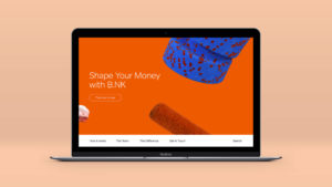
In response, we helped Banked define a novel value proposition, and provided key proof-of-concept visuals for their revolutionary finance app, The Shape of Money.
Our Role:
Art Direction, Motion Graphics, UI / UX Design
Collaborators:
Colors and the Kids

Beauty and the banker
Uniting all of a user’s accounts and financial information on a single interface, Banked aims to make digital banking more beautiful, effortless, and secure. Believing that transparency and dashboarding have the power to make users more responsible about financial decision-making, they aim to change the way we interact with money.


“Athletics pull off a rare trick. They can apply rigorous strategic thinking without ever losing the lightness and energy that is needed to deliver extraordinary, affecting work.”
Patrick Cox, Founder, Banked
Design is an asset
The challenge Athletics faced was how to use design to shed new light on a user’s financial health. With personal financial data functioning as our raw input, we needed to find creative ways to convey the meaning of data in ways that illuminate, not obfuscate.

Making money move
Basing our design on rigorous user experience research, we conceived a system that translated financial data into responsive renders in real-time, helping Banked convey a more nuanced, tactile, and visually stimulating reflection of a user’s financial position.

Each shape was assigned two states. A resting state to indicate financial balance and an alert state to indicate abnormal spending, anomalous decrease in account balance, or suspected fraud.

