Responsive Vertical Spacing
A creative studio is like an orchestra. The constituent disciplines (strategy, design, and technology in the case of Athletics) are the instrument families (brass, strings, woodwind, and so on), each delivering a discrete tone, quality, and role within the greater whole. Certain projects call for solos: an exclusively technical challenge warrants a team exclusively composed of technologists. But in more complex engagements—the type we prefer—the disciplines harmonize to produce something greater than the sum of it parts.
In this essay, Senior Designer Allison Connell and Senior Creative Technologist Britton Walker—representatives from two of Athletics’ core disciplines—share their approach to Responsive Vertical Spacing, a pervasive challenge in the design and development of digital experiences. Specifically, they dissect an Athletics-authored Bootstrap extension designed to simplify Responsive Vertical Spacing. By serving aesthetic and technical goals with a single tool, this extension presents a microcosm of productive teamwork across two disciplines at the heart of the Athletics studio model—and the creative industry at large.
Spacing isn’t sexy. The negative space between elements lacks the flair of the elements themselves, whether expressive typography, stylish photography, or a vivid color palette. Nevertheless, spacing plays a critical albeit more subconscious role in a well-balanced visual design system, on par with typography, photography, color, iconography, and graphics. The proper spacing of design elements accentuates the design elements themselves, giving them space to breathe and indicating their degrees of importance for the audience. Operationally, having rules to dictate spacing makes the assemblage of design elements faster and more intuitive, leaving less room for unwanted creative license while increasing the formal consistency of different designs.
A selection of Vignelli’s grids from the Vignelli Center for Design Studies at RIT.
If a design is like a dinner table, then a grid defines the rules of place setting: the distances between fork, knife, spoon, plate, and glasses. By establishing vertical and horizontal axes, a grid specifies the proper spacing and arrangement of elements. Designer Massimo Vignelli understood that the grid is the most powerful tool in a designer’s arsenal. His Vignelli Canon (Lars Müller, 2015) states:
For us Graphic Design is ‘organization of information.’
There are other types of graphic design more concerned with illustration or of a narrative nature. Nothing could be more useful to reach our intention than the Grid. The grid represents the basic structure of our graphic design, it helps to organize the content, it provides consistency, it gives an orderly look and it projects a level of intellectual elegance that we like to express.”
Responsiveness refers to a digital experience’s ability to adapt to various screen-sizes, ranging from mobile devices to computer displays and everything in-between. Translating the grid principle to the responsive web poses some inherent challenges not apparent in static print design. Often, when faced with the challenge of applying a grid system to a digital context, coders turn to Bootstrap, a widely-adopted front-end HTML, CSS, and JS library that offers pre-built components, variables, mixins, components, and plugins. Originally designed by Twitter, Bootstrap makes development faster, easier, and more standardized.

Bootstrap gets so many things right. But when it comes to responsive grid solutions, specifically those relating to vertical spacing, the library fails to meet the needs of a sophisticated user. Bootstrap’s model is based on using percentages rather than pixels to define responsive spacing across screen sizes, making it more of a blunt instrument than a precision tool. The expression “pixel perfect” comes to mind, in that a pixel-based system accommodates finer detail by using established responsive breakpoints as screen sizes change across devices. In a percentage-based system, on the other hand, spacing is defined by a percentage corresponding to the base font size.
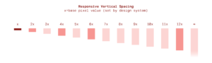
Starting from Bootstrap’s pre-existing spacing utility classes, we re-modeled the tool to define margin and padding size based on a pixel value as opposed to percentage value. Here’s how it works.
This process will define your utility classes:
- Define all the margin and padding properties you want to create classes for.
- Register the relevant breakpoints, such as mobile, tablet, desktop, and larger screens if necessary.
- Choose a base value that will be multiplied in the utility class to define your pixel value.
- Your utility classes will be generated using the following formula…
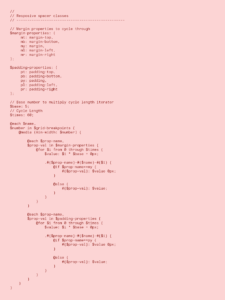
This is how you’ll apply your classes to the markup in real-time:
- Define the CSS property to modify
- Define the desired starting breakpoint
- Choose the multiplication value (that will be multiplied by the base value set you defined above)
For example: mt-xs-3
If your basis is set to 5 pixels, this declaration would apply 15 pixels to the top margin at the extra small breakpoint.
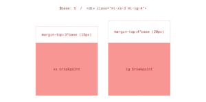
This is useful in the HTML markup because you know the CSS property value without having to navigate to a different CSS file; as you can see above, the semantic language is pre-configured within the utility class name.
We’re glad to make this utility available to you for your own projects. If you implement it, we’d love to hear how it works for you. Please reach out to hello@athletics.com.