Record Time with Malcolm Buick Pt. 2
by Malcolm Buick, Creative Director, Athletics
Zander Abranowicz, Writer and Strategist, Athletics
In the first installment of Record Time with Malcolm Buick, we explored the dynamics of modern design contrasted with the tactile pleasures of the analog days of record sleeve design. To prove the point, Malcolm asked a few of his friends to share their favorite record designs, and why they left such an impression.
Here, we share some additional friend (and colleague) favorites for your reading, viewing, and listening pleasure. More installments to come…
Eric Demby
Co-Founder, Brooklyn Flea, Smorgasburg, Berg’n
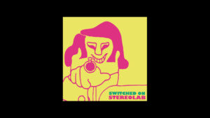
Album Title — Switched On
Artist — Stereolab
Year — 1992
Illustrator — Antonholz Portmann (pseudonym)
Stereolab’s first three records came out at a heady time for early-20s me, as I was soaking up oceans of indie music and still at a time when making connections between what I loved was pure discovery—practically detective work combining magazine clue-hunts, record-store-clerk interrogations, and liner-note / album-cover sleuthing and cross-referencing. So when Stereolab’s Switched On debut turned me on with its op-art color contrast and sinister grin, plus their Marxist lyrics, I took it as a signal to dig deeper into their visual motives. That was confirmed when their follow-up Lo-Fi EP and Peng! LP featured continuations of the theme where a finger turns first into a gun and then its exploding barrel, which I asked them about during an interview with singer Laetitia Sadier for my college magazine in (I think) 1993. She told me how this character is named “Cliff,” and was plucked from a recurring comic in a 1970 issue of “Hotcha,” an underground revolutionary newspaper based in Zurich. The cartoonist Antonholz Portmann (a pseudonym) had depicted Cliff as a figure of the establishment who is eventually shot by the revolutionaries. It was the kind of discovery that pushed me to keep digging deeper and deeper into their and all music I loved and to ask for and receive more more more of all of it: music, revolution, art, connections.
Matt Owens
Creative and Project Lead, Athletics
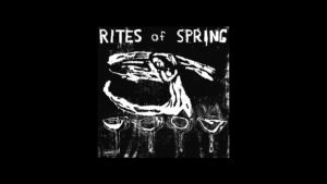
Album Title — Rites of Spring LP
Artist — Rites of Spring
Year — 1985
Layout (Graphics Coordination) — Jeff Nelson
Photography — Tomas Squip Bert Queiroz, Cristina Martinez, Cynthia Connolly
I bought the Rites of Spring LP some time around 1988, when I was 17. By this time the band had broken up they but had a mythological status among my hardcore punk friends. The record cover is a hand-made graphic wood cut and feels raw, urgent, and emotionally human just like the music created by Michael Fellows, Brendan Candy, Eddie Janney, and Guy Picciotto. Every song is amazing and even today this record is one of my favorites of all time. In hindsight I think the Rites of Spring LP was the first graphic design artifact that I genuinely treasured. The graphics, photography, and music are all one idea to me. Whether I realized it or not at the time, I think this record was one of the big reasons (along with other Dischord Records and skateboard graphics of the 80s) that made me understand that graphic design could be as emotional and meaningful as music or art or anything else. The record also made me realize that you could create things (music, zines, records, anything) and you did not need to be professional. This was really liberating to me and set the stage for everything I am today.
Jason Gnewikow
Creative Director, Athletics
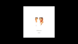
Album Title — Please
Artist — Pet Shop Boys
Year — 1986
Designer — Mark Farrow
It’s truly a monstrous question to be asked what your favorite album cover is. To reduce an obsession that has spanned a couple of decades to one singular record is absolutely impossible. Albums both visually and sonically have been checkpoints in time that mark moments in life. So many are so special, for so many different reasons.
But I suppose it makes sense to start with one that for me created an itch, as a designer, that I suppose I’m still trying to scratch to this day. I bought Pet Shop Boys’ Please on a church field trip in 8th grade at Wax Trax records in Denver, Colorado. I’m honestly not sure what drew me to it; I had never heard of them. I was squarely in the midst of a punk rock obsession and certainly not consciously aware of design. I bought The Descendents Hallraker album at the same time, which in contrast to Please has a spare and graphic album cover. Most punk records at the time were visually complex, rough, raw, layered, and aggressive. Please was the complete opposite: a stark white cover with a tiny image of Chris Lowe and Neil Tennant both dressed in white, perfectly centered in a sea of white space, with the band name and album title set in impossibly small lowercase letters. I should also say that the music on the album — although delivered squarely through a pop lens — lyrically had an indelible “otherness” that as a queer punk rock kid I instantly identified with. Their aptitude for creating highly considered and intentional visuals in everything they have done for four decades is simply uncanny.
I don’t think I registered it at the time, but this was the catalyst for what became a healthy obsession for album design emerging from the UK, laying the blueprint for my own design sensibility. This was also, needless to say, the beginning of a life-long love of Pet Shop Boys.
Editor’s note: Gnewikow is a renowned record sleeve designer in his own right. Read this recent interview about the legacy of his work in Mel Magazine.